Case Studies
From Abandoned Carts to a 38% Sales Surge
ThreadHaus Co. had a product people genuinely loved — a premium menswear brand with a loyal offline following and a fast-growing Instagram presence. But their online store told a different story. Built on a bloated Shopify theme in 2019, the site felt like a relic: sluggish on mobile, hard to navigate, and visually disconnected from the brand they'd worked years to build. Customers were arriving from social ads, clicking around for thirty seconds, and leaving — often before they ever reached a product page.
When they approached Safi Dot Tech, the brief was deceptively simple: "fix the store." What we found underneath was a classic case of a brand that had outgrown its digital presence. Their product photography was stunning. Their copy was sharp. But the experience wrapped around it was quietly killing conversions every single day. We didn't just fix the store — we rebuilt the commercial engine behind it.
Strategic Implementation
& Digital Results
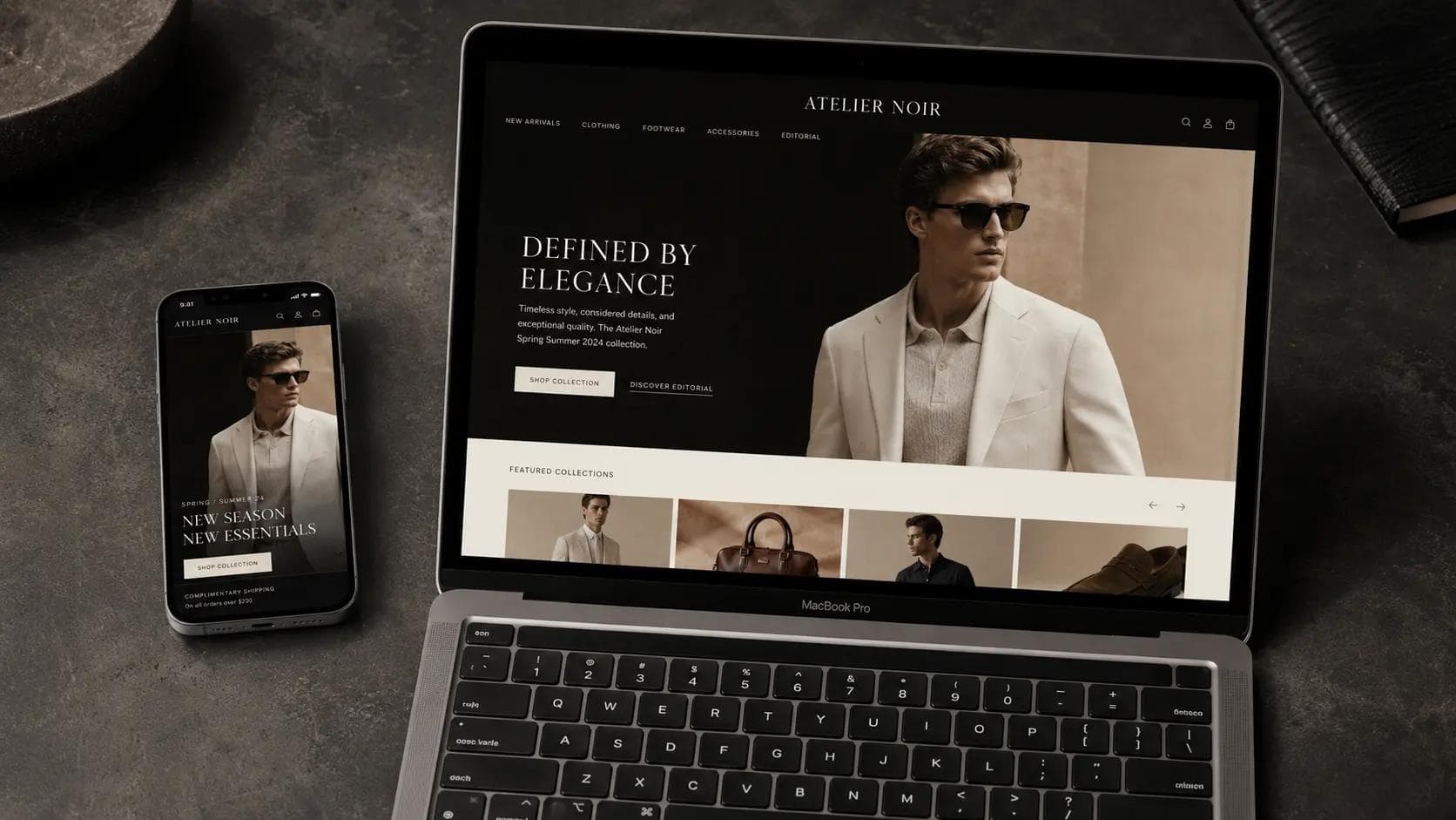
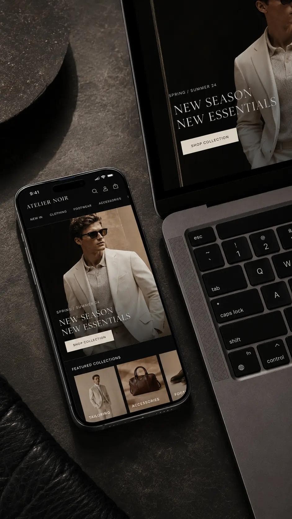
We started with a full UX audit — heatmaps, session recordings, and exit-intent data — to understand exactly where customers were dropping off and why. The data pointed to three compounding problems: a broken mobile journey, a visual identity that undersold the product, and a site architecture that made discovery frustrating.
Our redesign rebuilt the Shopify storefront from the theme level up. We implemented a custom mobile-first layout with a streamlined 3-step checkout, redesigned product pages with sticky add-to-cart CTAs, and introduced a smart filter system using Shopify's native metafields. For performance, we compressed and lazy-loaded all imagery, eliminated redundant app scripts, and reduced the JavaScript bundle by 61%. The result: a mobile PageSpeed score of 81 and an average load time of 2.8 seconds.
Visually, we built a design system grounded in ThreadHaus's actual brand — a refined typographic hierarchy, a neutral-warm color palette pulled from their best product photography, and editorial-style collection pages that felt closer to a lookbook than a category listing. Within 60 days of launch, the client reported a 38% increase in completed purchases and a 52% drop in cart abandonment rate.
Background
ThreadHaus Co. had a product people genuinely loved — a premium menswear brand with a loyal offline following and a fast-growing Instagram presence. But their online store told a different story. Built on a bloated Shopify theme in 2019, the site felt like a relic: sluggish on mobile, hard to navigate, and visually disconnected from the brand they'd worked years to build. Customers were arriving from social ads, clicking around for thirty seconds, and leaving — often before they ever reached a product page.
When they approached Safi Dot Tech, the brief was deceptively simple: "fix the store." What we found underneath was a classic case of a brand that had outgrown its digital presence. Their product photography was stunning. Their copy was sharp. But the experience wrapped around it was quietly killing conversions every single day. We didn't just fix the store — we rebuilt the commercial engine behind it.
The Challenges
- Mobile experience was broken — over 67% of traffic came from phones, yet the theme was designed desktop-first, with overlapping elements, tiny tap targets, and a checkout flow that required six steps to complete a purchase.
- Page speed was critically low — a Google PageSpeed score of 34 on mobile meant customers on 4G connections waited 7+ seconds for the homepage to become interactive. Every second of delay was costing real revenue.
- Product discovery was a dead end — no filtering system, inconsistent category structure, and a search bar that returned zero results for common queries like "slim fit" or "linen shirt." 4. The brand felt cheap online — despite premium pricing and high-quality products, the visual design used stock-looking fonts, low-contrast layouts, and imagery that didn't reflect the editorial quality of their own photoshoots.
The Solution
We started with a full UX audit — heatmaps, session recordings, and exit-intent data — to understand exactly where customers were dropping off and why. The data pointed to three compounding problems: a broken mobile journey, a visual identity that undersold the product, and a site architecture that made discovery frustrating.
Our redesign rebuilt the Shopify storefront from the theme level up. We implemented a custom mobile-first layout with a streamlined 3-step checkout, redesigned product pages with sticky add-to-cart CTAs, and introduced a smart filter system using Shopify's native metafields. For performance, we compressed and lazy-loaded all imagery, eliminated redundant app scripts, and reduced the JavaScript bundle by 61%. The result: a mobile PageSpeed score of 81 and an average load time of 2.8 seconds.
Visually, we built a design system grounded in ThreadHaus's actual brand — a refined typographic hierarchy, a neutral-warm color palette pulled from their best product photography, and editorial-style collection pages that felt closer to a lookbook than a category listing. Within 60 days of launch, the client reported a 38% increase in completed purchases and a 52% drop in cart abandonment rate.
The Competitive
Edge Delivered.
Like What You See?
Every project starts with a conversation. Let's discuss how we can bring this level of strategic digital expertise to your next business challenge.
Let's Talk