Case Studies
A Fintech App That Made First-Time Investors Feel Like Insiders
VaultWise Financial is a UK-based micro-investment platform targeting first-time investors aged 25–40 — people who are financially curious but intimidated by the language, complexity, and opacity of traditional investment tools. Their core product allowed users to build diversified portfolios starting from as little as £10. The concept had genuine product-market fit: early beta testers loved the idea. But the original web app — built quickly by a freelance developer to hit a funding demo deadline — felt like a developer prototype dressed up as a product. It was functional, but it communicated zero trust.
In fintech, trust is the product. And VaultWise was trying to convince risk-averse first-time investors to hand over real money through an interface that looked like it had been assembled in a weekend. Following their seed funding round, they brought Safi Dot Tech in to rebuild the application from the ground up — turning a working prototype into a platform people would actually trust with their savings.
Strategic Implementation
& Digital Results
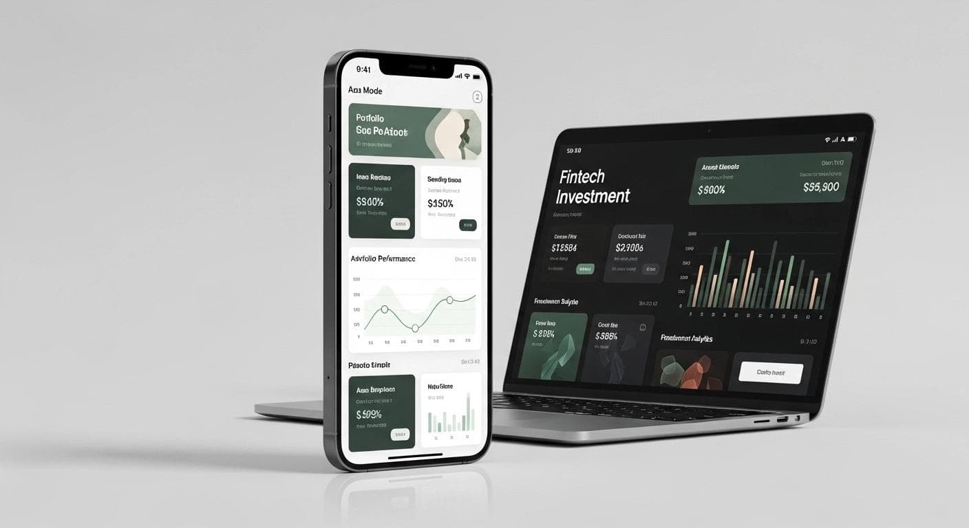
We started by reframing the core design challenge: this wasn't an investment app — it was a confidence app. Every design decision needed to reduce anxiety before it informed the user. We built a new visual language around clarity and warmth: a light-mode-first interface with a palette of deep sage green, warm white, and soft gold — colors associated with financial security rather than speculative risk.
The onboarding flow was rebuilt from seven steps to four, with a visible progress bar, plain-English explanations for every data field ("We ask for your National Insurance number to verify your identity — it's never shared or stored insecurely"), and a celebratory confirmation screen that framed completing setup as an achievement. Drop-off in onboarding fell by 61% in the first month.
Portfolio views were redesigned around the concept of "My Story" — a personalized performance narrative at the top of the dashboard that generated a two-sentence plain-English summary of how the user's portfolio had moved and why, alongside clean annotated charts with toggle controls that worked flawlessly on mobile. Trust signals were woven throughout: visible FCA authorization badges, an always- accessible "How your money is protected" explainer panel, and a session security indicator in the nav. In post-launch user testing, "feeling safe to use" ratings rose from 2.1 to 4.7 out of 5.
Background
VaultWise Financial is a UK-based micro-investment platform targeting first-time investors aged 25–40 — people who are financially curious but intimidated by the language, complexity, and opacity of traditional investment tools. Their core product allowed users to build diversified portfolios starting from as little as £10. The concept had genuine product-market fit: early beta testers loved the idea. But the original web app — built quickly by a freelance developer to hit a funding demo deadline — felt like a developer prototype dressed up as a product. It was functional, but it communicated zero trust.
In fintech, trust is the product. And VaultWise was trying to convince risk-averse first-time investors to hand over real money through an interface that looked like it had been assembled in a weekend. Following their seed funding round, they brought Safi Dot Tech in to rebuild the application from the ground up — turning a working prototype into a platform people would actually trust with their savings.
The Challenges
- The interface communicated risk instead of confidence — dark, dense, graph-heavy layouts used color schemes and terminology that felt more like a Bloomberg terminal than a beginner-friendly investment app. New users rated it 2.1/5 for "feeling safe to use" in exit surveys.
- Onboarding dropped 78% of users — a seven-step KYC and portfolio setup flow with no progress indicators, confusing financial jargon, and zero explanation of why certain information was being collected.
- Portfolio performance views were unreadable — charts had no contextual annotation, no plain-language performance summaries, and no way to toggle between time periods without breaking the view on mobile.
- Security UX was absent — while the backend security was solid, the interface showed no visible trust signals: no SSL indicators, no session management visibility, no clear communication about how funds were protected.
The Solution
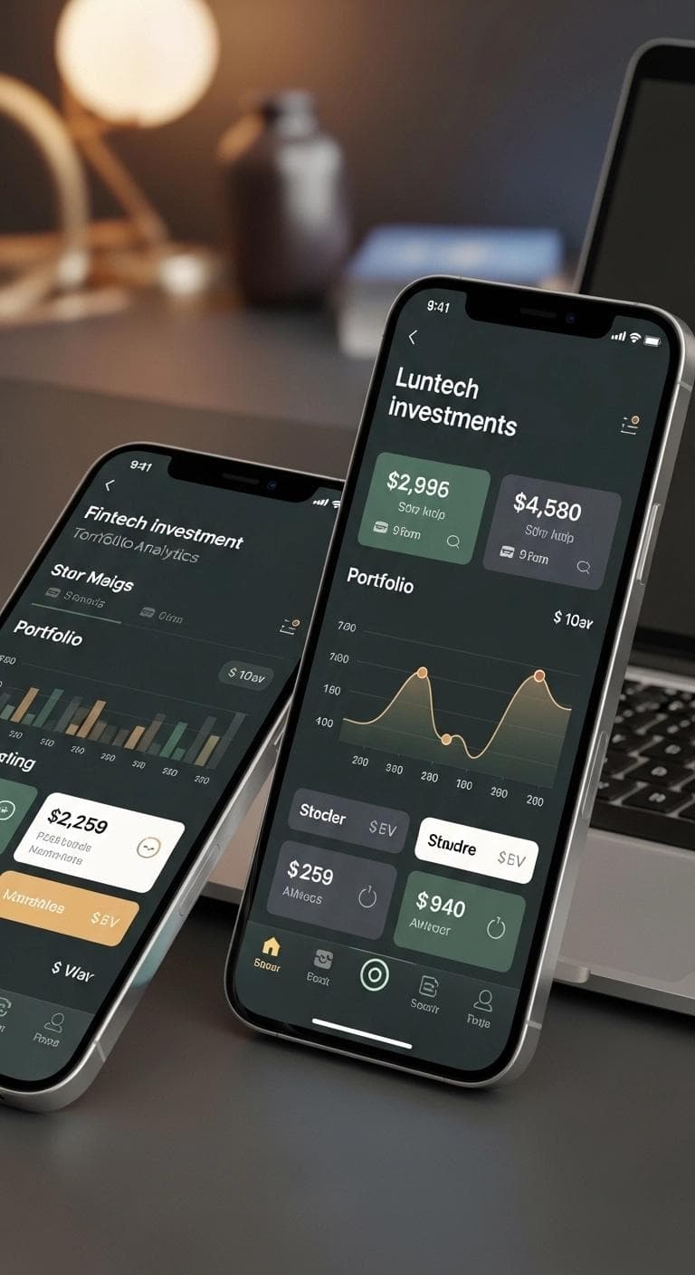
We started by reframing the core design challenge: this wasn't an investment app — it was a confidence app. Every design decision needed to reduce anxiety before it informed the user. We built a new visual language around clarity and warmth: a light-mode-first interface with a palette of deep sage green, warm white, and soft gold — colors associated with financial security rather than speculative risk.
The onboarding flow was rebuilt from seven steps to four, with a visible progress bar, plain-English explanations for every data field ("We ask for your National Insurance number to verify your identity — it's never shared or stored insecurely"), and a celebratory confirmation screen that framed completing setup as an achievement. Drop-off in onboarding fell by 61% in the first month.
Portfolio views were redesigned around the concept of "My Story" — a personalized performance narrative at the top of the dashboard that generated a two-sentence plain-English summary of how the user's portfolio had moved and why, alongside clean annotated charts with toggle controls that worked flawlessly on mobile. Trust signals were woven throughout: visible FCA authorization badges, an always- accessible "How your money is protected" explainer panel, and a session security indicator in the nav. In post-launch user testing, "feeling safe to use" ratings rose from 2.1 to 4.7 out of 5.
The Competitive
Edge Delivered.
Like What You See?
Every project starts with a conversation. Let's discuss how we can bring this level of strategic digital expertise to your next business challenge.
Let's Talk